

central balance
branding, print & digital, social media, UI
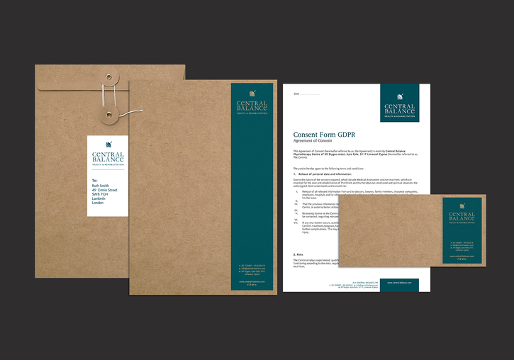
In order to differentiate from direct competition and position the business appropriately; as a medium to premium clinical pilates, physiotherapy, rehabilitation, and alternative therapy practice, the name of the company was carefully chosen, accompanied by the logo and all other assets of the branding collateral.
The spinning top portrays the all-rounded, client-centric nature of the practice whilst the paint textures and the use of kraft-brown paper communicate the humanised and approachable character of the centre. The marketing plan I developed for the first year included radio campaigns, print material, and enhancement of the brand across social media.

Garamond
PT Sans


A combination of clinical, lifestyle, and environment (premises & amenities) photography has been selected for use throughout the website*, in addition to images showcasing the services and the team. The colour palette has been determined in such way that complements each service individually and transitions from more clinical colours (white, dark green) to softer and brighter earth tones (orange, beige, off-white).
_website under development


Energy Techniques

Specialised &
Clinical Pilates
private & group sessions
PF Diplomat Poly


